

Packaging Design Summative
Summative Brief
"A well-known fictional location has recently opened a small shop catering to the visitors and residents of the area.
The store has an extensive range of products already in stock but there is always room for more.
The packaging should show a connection to the location and customers in the area.
The product needs to be packaged for sale. It should be easily identifiable, and packaged in a format that is appropriate and help the product stand out on the shelf."
I chose the Hundred Acre Wood because it resonates with me on a personal level. I’ve always loved Winnie the Pooh books, and this setting has a timeless charm that feels warm and familiar.
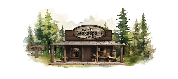
Store Name & Logo

I went with the name The Beekeeper’s Cottage — a choice that feels whimsical, gentle, and rooted in the storybook charm of the Hundred Acre Wood.
Inspired by the hand-drawn world of Winnie the Pooh, I designed scarf packaging that evokes warmth and simplicity, using soft illustrations and playful details that feel homemade and heartfelt.
The name helped guide the tone of the entire project, inviting customers into a cozy woodland setting where each scarf feels like a keepsake from a quiet adventure.

Scarf Brand & Logo
I chose the name Cedar and Stitch for my scarf brand to evoke a sense of woodland charm and handmade care — a perfect fit for the Hundred Acre Wood setting. “Cedar” brings in the natural, earthy feel of the forest, while “Stitch” hints at craftsmanship and coziness. Together, the name suggests something both rustic and refined, like scarves lovingly made in a cottage tucked beneath the trees. It guided my logo and packaging toward a hand-drawn, nostalgic aesthetic that feels right at home in a world of honey pots, soft textures, and gentle adventures.

Other Logo Concepts
I explored several logo concepts that reflected the handcrafted charm of Cedar and Stitch. While designs featuring knitted leaves and textured lines were appreciated for their detail, some elements felt too intricate at smaller sizes.
The concept with knitting needles stood out for its visual interest, but the gold design ultimately won out. It offered clarity, warmth, and a woolen softness — especially with the ampersand shaped from a loose strand of yarn — making it the strongest fit for the brand’s storybook feel
Final Flat Lay

Final Design

This assignment required patience and plenty of prototyping to get right. It really challenged my flat lay design skills, especially as I shifted direction midway to embrace a more hand-drawn, Winnie the Pooh-inspired aesthetic — without using the characters themselves. That change brought warmth and whimsy to the final outcome. I’m proud of the design I created and pleased with the creative ideas that emerged along the way.
